UPRISE IDENTITY
2025
Uprise was created to bring Cycle Solutions' passion and expertise directly to riders through a welcoming and community-focused brand experience.
Scroll Down

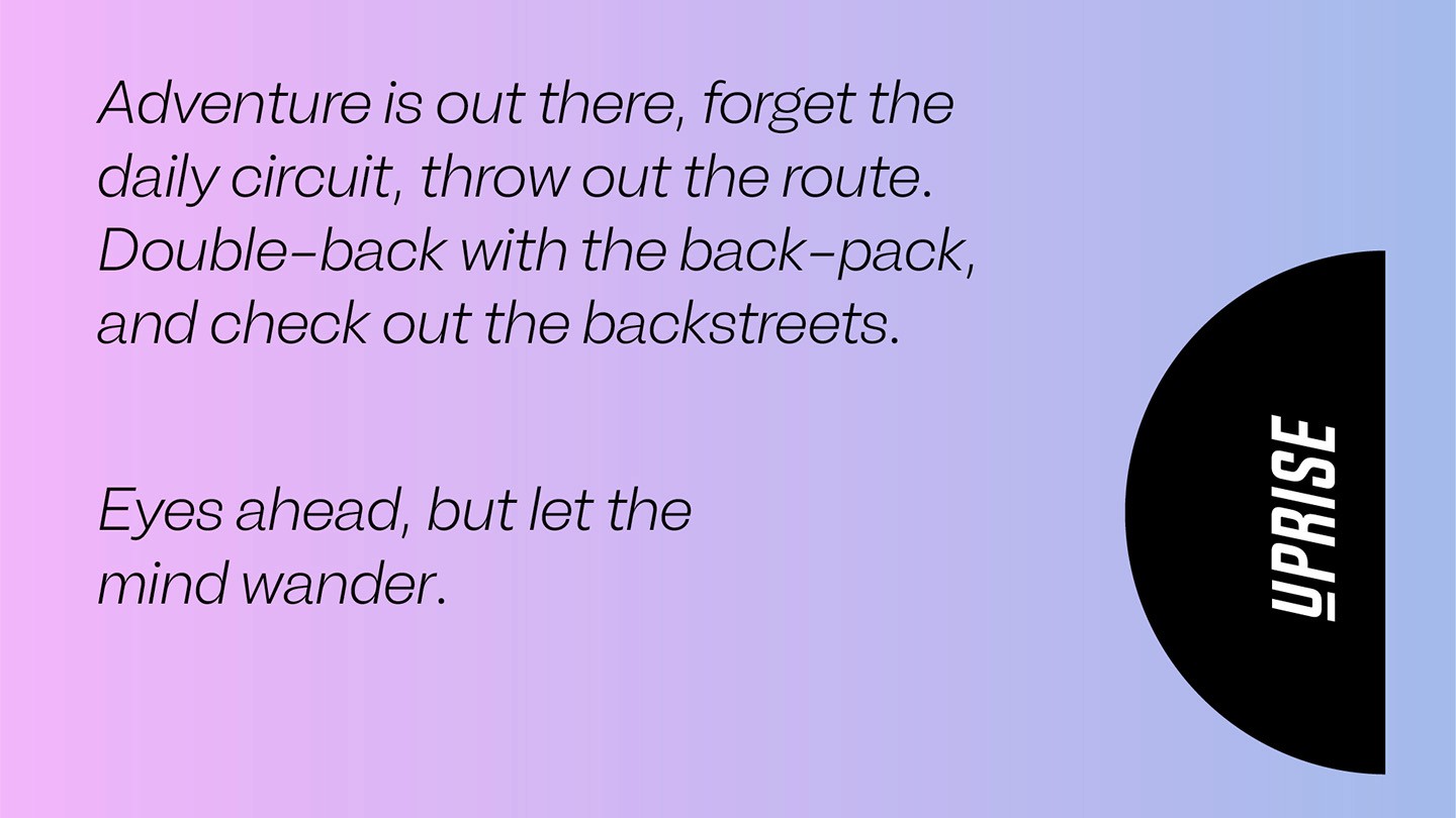
Embracing Curiosity
Cycle Solutions has built significant standing in the B2B cycle to work market by providing a quality service and unwavering commitment to employees across the corporate world. With a solid infrastructure and a team full of passion their vision was to deliver the same experience direct to riders at retail and they asked us to support with consultation, creative and implementation.
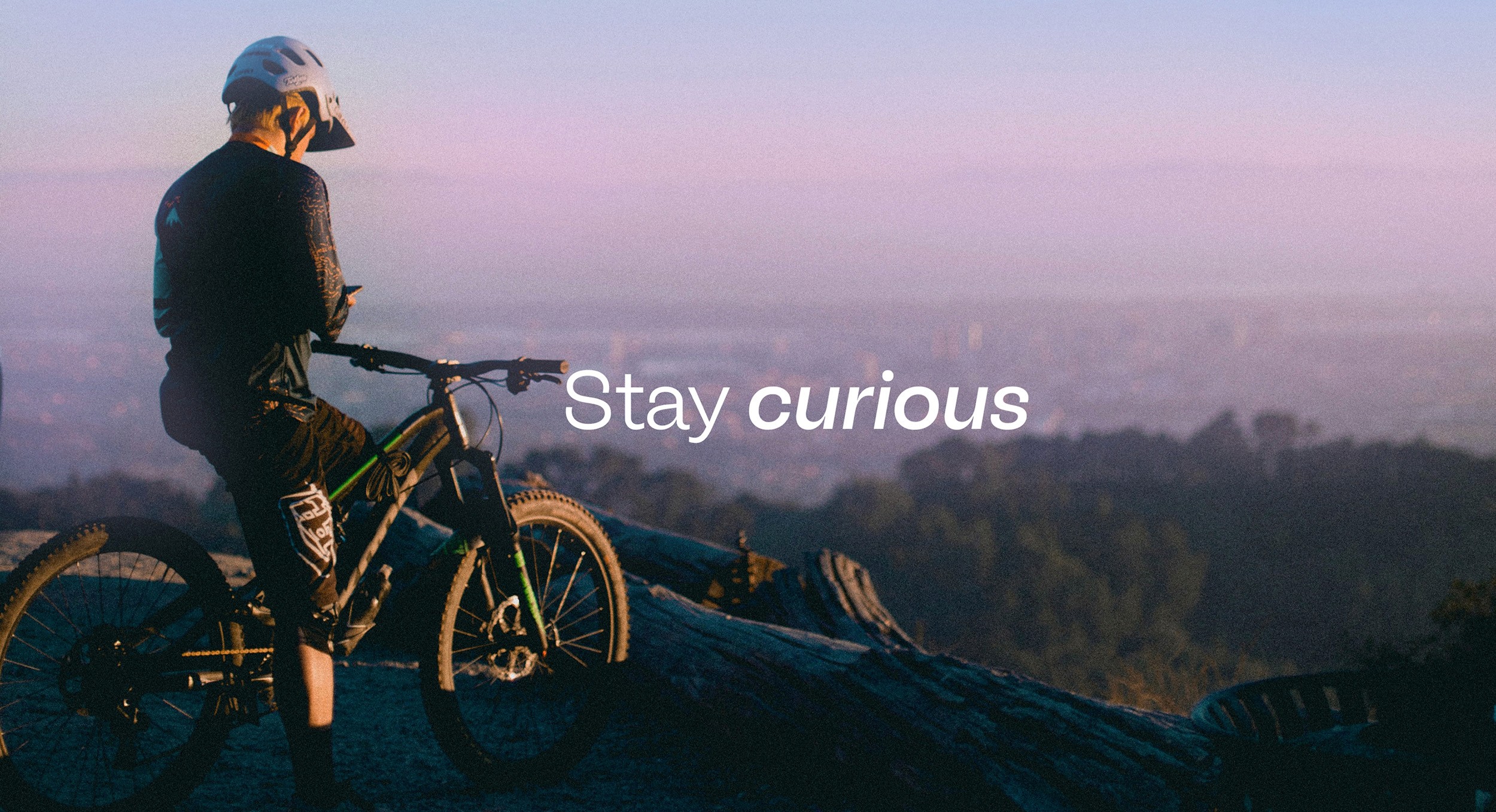
We created a new retail focussed brand, Uprise; we pointed their undeniable passion directly towards people, delivering energy, expertise and honesty through a brand experience which supports riders and doesn’t simply convert them. Harnessing the experience of being on two wheels – for the first time and every time – was the keystone of the creative.
Services
-
Identity Design
-
Brand Architecture
-
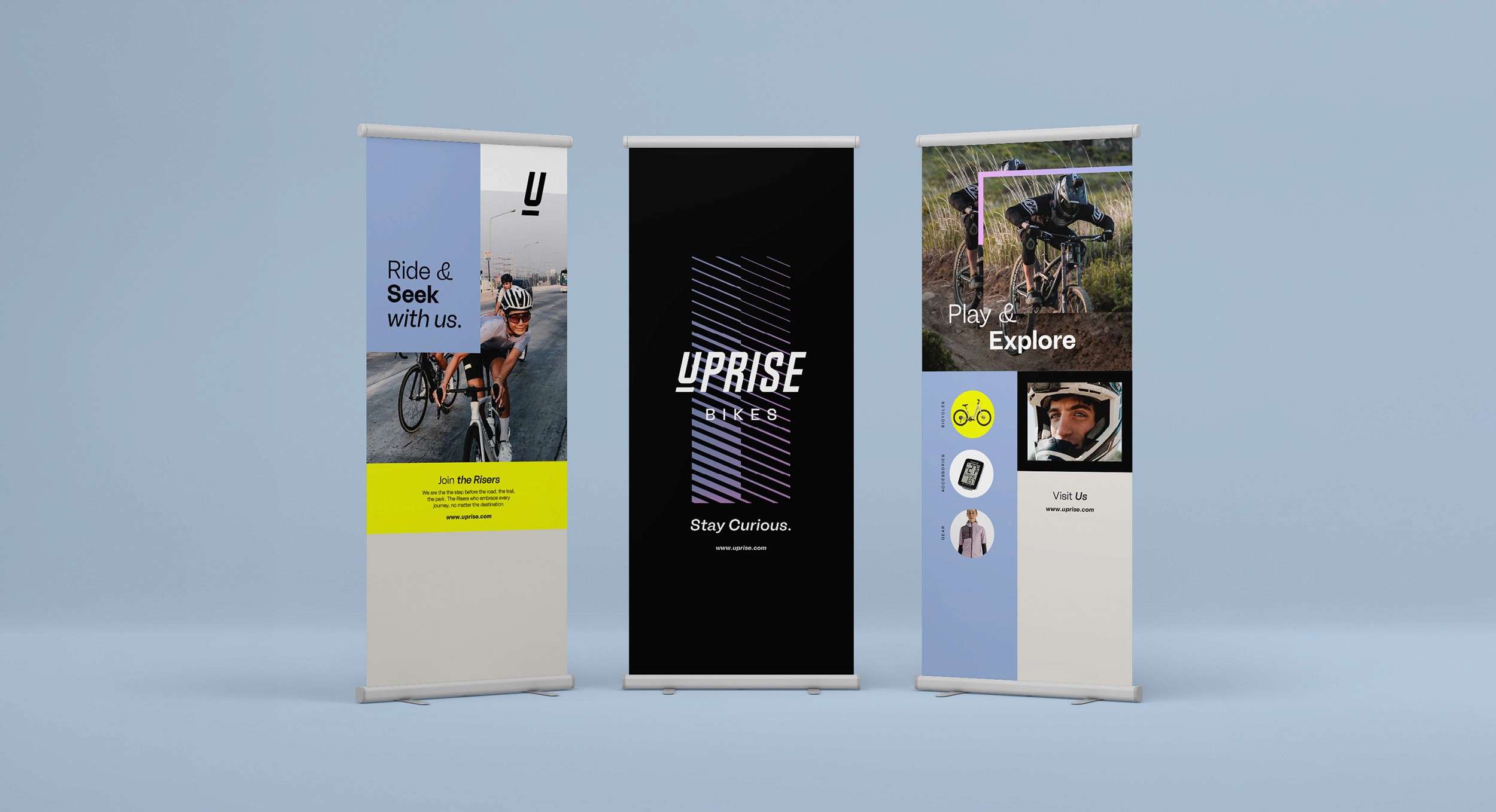
Visual & Verbal Identity
-
Art Direction
-
Motion Design
-
Illustration
-
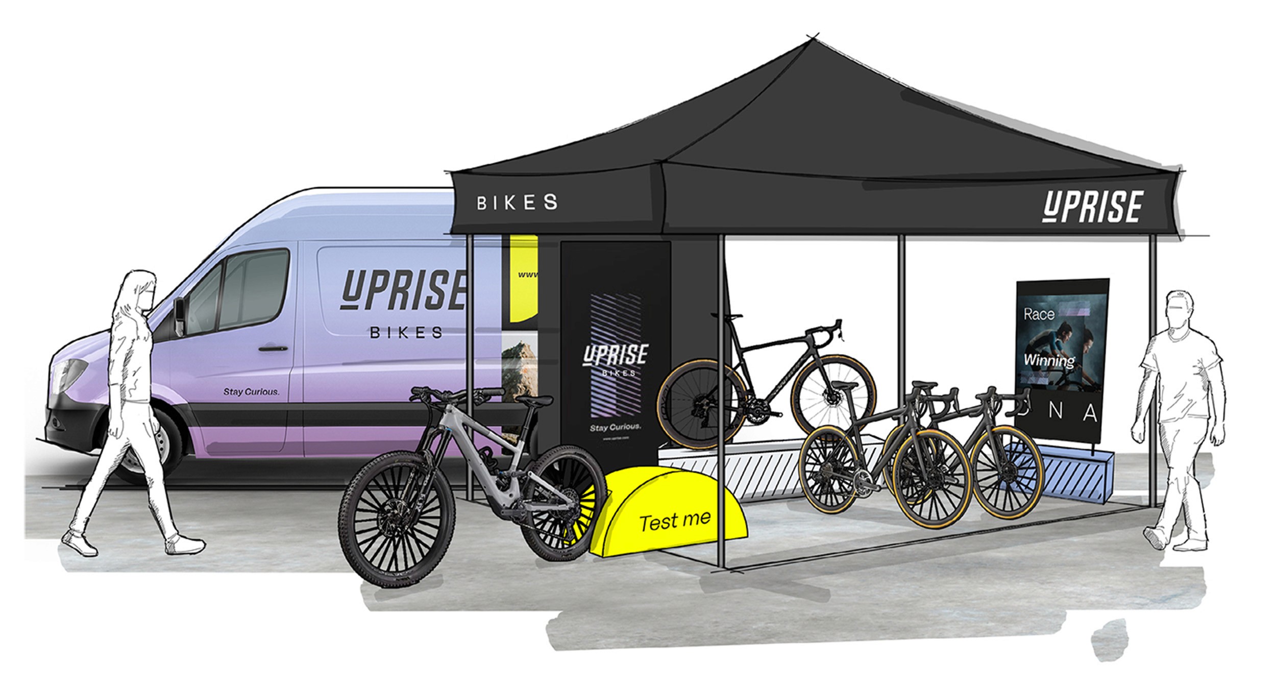
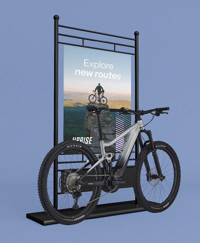
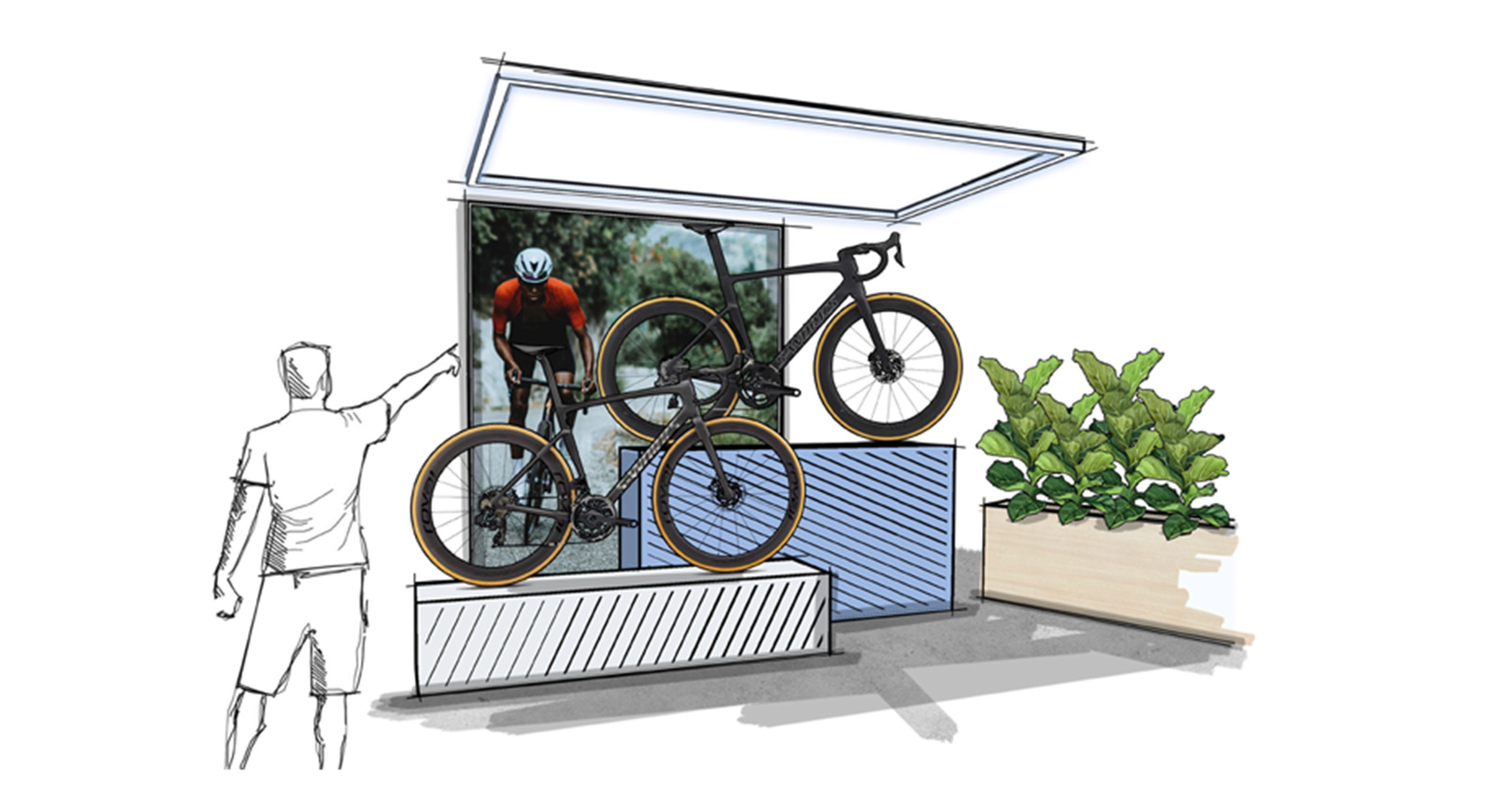
Retail Space Activation


Opportunity for growth
Working with their internal team we defined a new architecture to support the two business streams, separating and creating ownership for the B2C business through Uprise – allowing both to refocus their offerings, tone, communication and ultimately flourish.
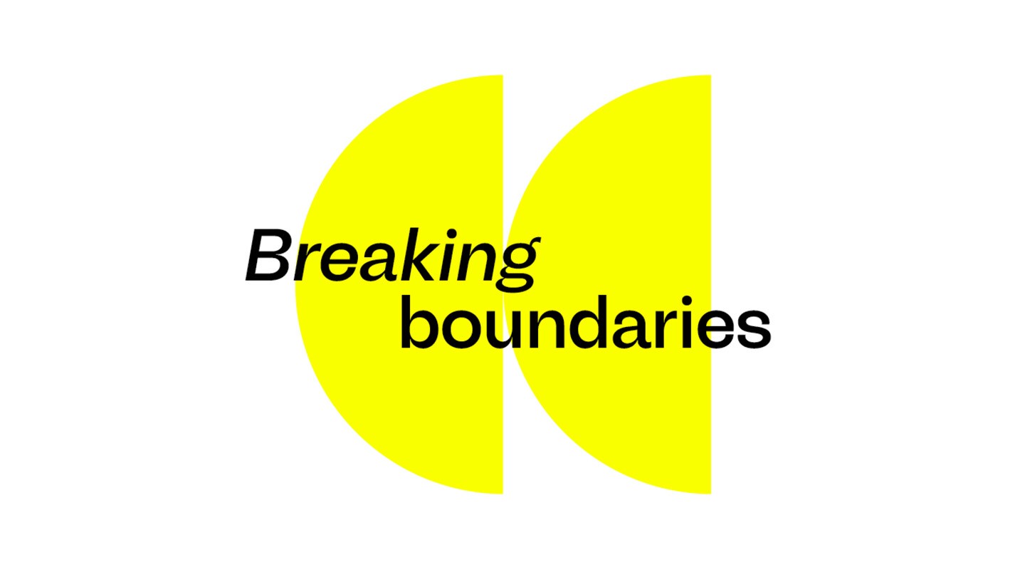
Positioning and developing a tone for the new brand which retained their rich history, whilst also crafting a compelling narrative that would capture a diverse audience was key to the brand strategy.
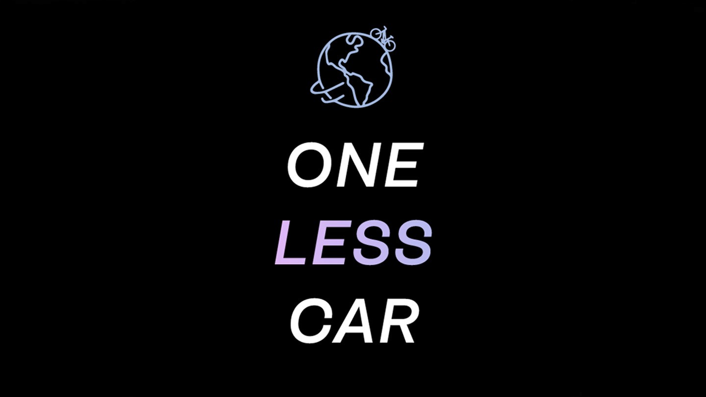
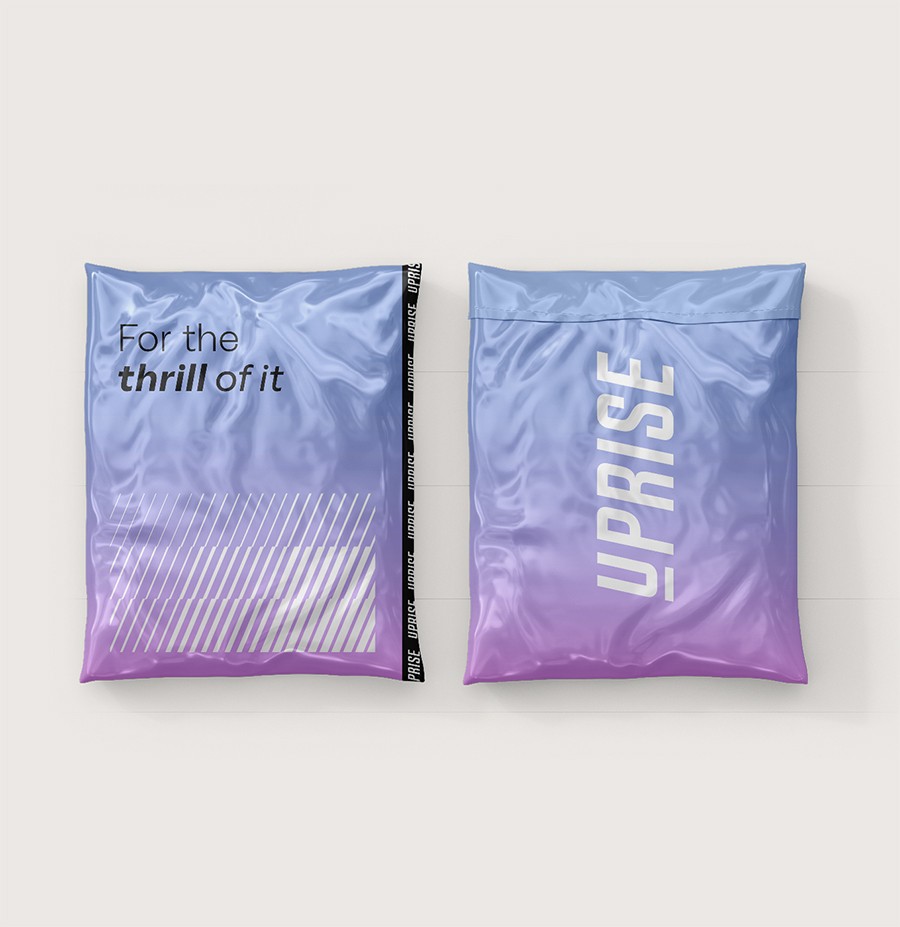
At the heart of this transformation is an energised colour palette featuring a contemporary gradient symbolising inclusivity, adventure and movement. Quirky typography adds a playful personality to the brand's communication, while illustrations and animations breathe life into content, showcasing cyclists of all backgrounds and infusing energy into the brand's online presence.
Energised patterns further enhance the visual language, representing the rhythm and motion of cycling.


Project Value
Uprise was created to give Cycle Solutions a dedicated consumer-facing brand, allowing the business to engage riders directly while building on the expertise and reputation established through its B2B offering. Through brand architecture, visual identity and creative strategy, we developed a distinctive brand centred around curiosity, adventure and accessibility.
We then brought the brand into the physical world through a flexible retail environment designed around experience, community and adaptability. Together, the identity and retail concept created a scalable platform for growth, helping Uprise build stronger customer connections and establish a unique position within the cycling market.